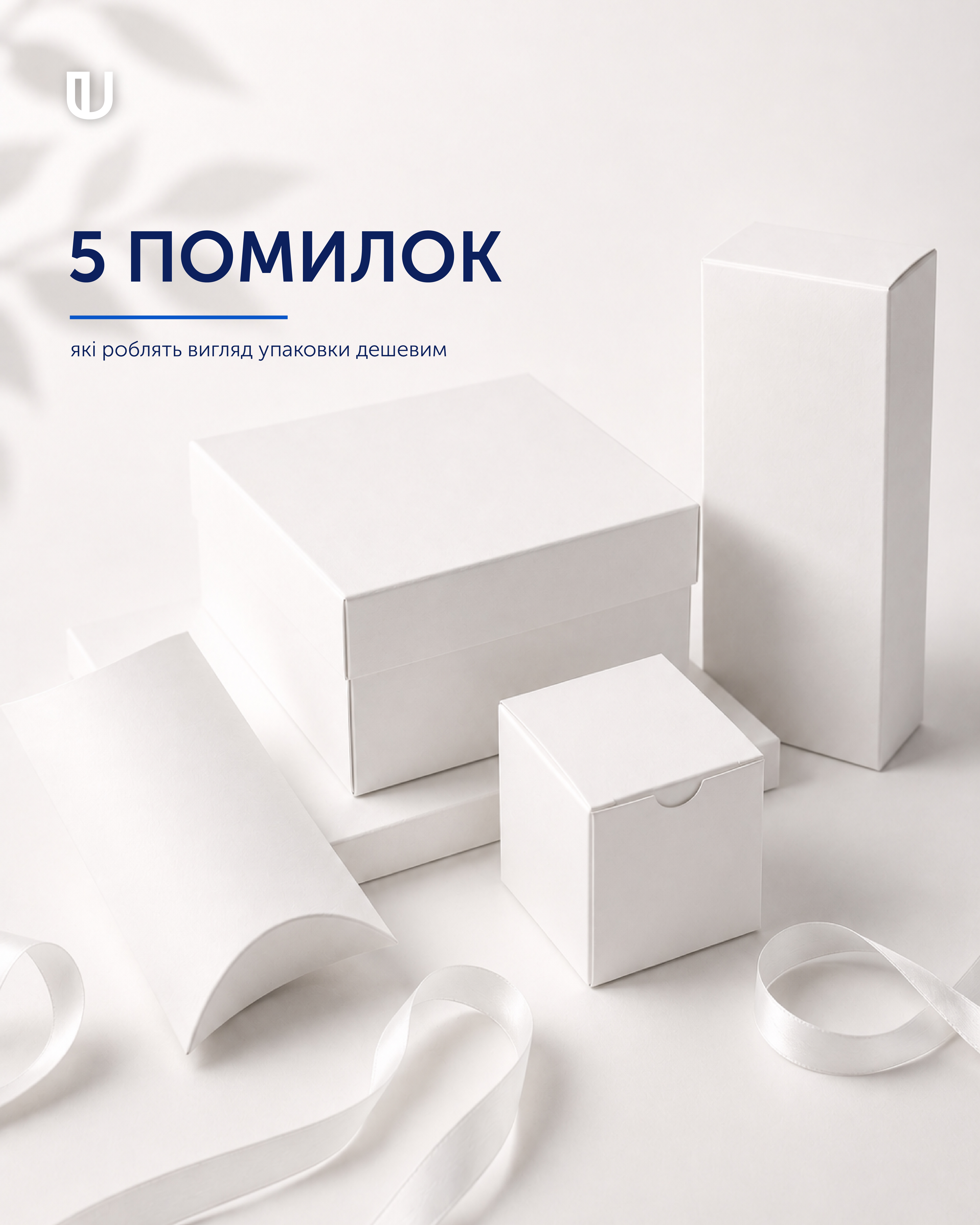
Even a high-quality product can appear less valuable to customers if its packaging fails to make the right impression. Packaging is often the first point of contact between a consumer and a brand, which makes its design, materials and production quality especially important.
So, what can make packaging look visually cheap? Here are five of the most common mistakes.
1. Too Many Design Elements
Too many colours, fonts, images, text and decorative elements can make packaging look chaotic. When everything is competing for attention, the overall design loses its clarity and balance.
Thoughtful minimalism often looks more premium than an overloaded design. The key is to define the main visual focus and build the composition around it while leaving enough white space.
2. The Wrong Choice of Material
Packaging is not only seen — it is held. The thickness, texture and stiffness of the cardboard, as well as the quality of its coating, all influence how a product is perceived.
Cardboard that is too thin or a material that does not match the product's positioning can make even a professionally designed package look less valuable.
For premium packaging, both visual appearance and tactile experience matter.
3. Excessive or Inappropriate Finishing
Foil stamping, embossing, spot varnishing, Soft Touch and other finishing techniques can make packaging more distinctive. However, using too many effects does not automatically make packaging look premium.
Finishing should enhance the design rather than overwhelm it. One carefully selected finishing technique can often be more effective than several decorative effects used at once.
4. Poor Print Quality
Even a well-designed package can lose its appeal during production. Blurred images, inaccurate colour reproduction, insufficient detail or registration errors can immediately affect the overall impression.
High print quality is particularly important for photographs, saturated colours, fine lines and small text.
Professional printing is one of the foundations of high-quality packaging.
5. Lack of a Consistent Brand Style
Packaging should reflect the character of the brand. If the colours, fonts, graphics, materials and finishing techniques do not work together, the product may look inconsistent and unprofessional.
Strong packaging design is a complete visual system in which every detail contributes to brand recognition.
Premium Packaging Is About the Right Details
Making packaging look premium does not mean adding as many decorative elements as possible. What matters more is the right combination of design, material, print quality and finishing.
These decisions shape the customer's first impression and help communicate the value of the product.
Ukrpol produces cardboard packaging in a wide range of shapes and constructions and offers finishing options such as varnishing, lamination, embossing and foil stamping. Designer papers and cardboards can also be used for premium packaging.
What do you think has the biggest impact on how packaging looks — design, material or print quality?